Visualizing Metrics
2023-06-27
The last project I worked on at my job was a data visualization system, specifically a metrics dashboard. Although my role was primarily on the back-end, I still provided input on the user experience for SREs (Front-End development of the system) and also to guide SREs on how to better use the new system. I didn't want to rely solely on my personal experiences, so I sought a more theoretical foundation. In this post, I will share some of my notes. Most of these notes were taken from "Better Data Visualizations" by Jonathan Schwabish, or from my own notes during the Complex Data Mining course.
What do we need to avoid?
When building a dashboard to display the health of a system, it's important to avoid spaghetti charts. These charts are difficult to read and should be avoided, especially since the dashboard may be used by people during late hours. Do you really want a tired person to try and make sense of a chart like this bellow?
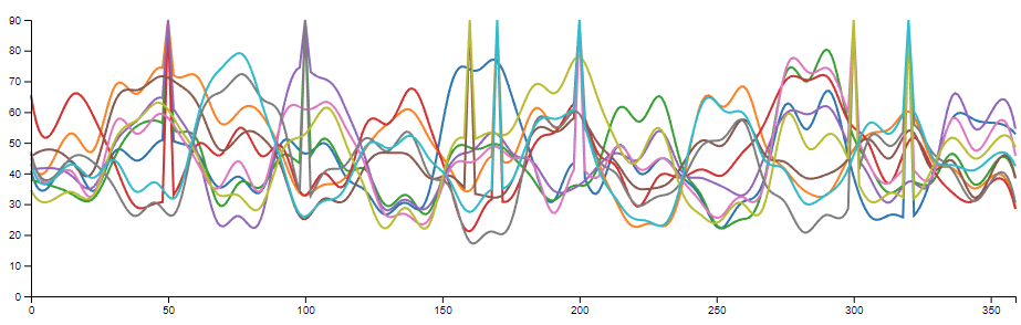
Following any of those timeseries can be challenging. One approach, suggested by Jonathan Schwabish, is to break the chart into multiple smaller versions. For instance, if you're displaying CPU usage on machines, you could break it down by AZ or region. Alternatively, you might want to filter the timeseries to focus only on those with big changes in the last few minutes.
Pie charts are generally not recommended. Schwabish explains that humans struggle to compare slices of different sizes easily (refer to the chart below to see which one clearly shows the proportion of each company's revenue). Although there are cases where it’s acceptable to use pie charts, such as when the slices are of known proportions (e.g. 50%-50%; 25%-25%-25%-25%), we are specifically discussing metrics and creating a useful dashboard for SREs. Since the data will be dynamic, you want your engineers to be able to quickly scan the dashboard and get a sense of what is wrong. Parsing a pie chart takes time and may lead to the wrong conclusion. Therefore, it is best to avoid using them.
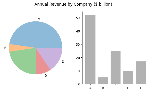
(Image from https://towardsdatascience.com/the-case-against-the-pie-chart-43f4c3fccc6 )
Another point to avoid is relying solely on the average. Depending on the distribution of your data, it may mislead you. A great article on this topic can be found at Towards Data Science.
For metrics, you are probably not interested in averages, but rather in values such as p90, p99, or max/min.
Accessible dashboards
In our industry, many people assume that certain things are "obvious" and don't bother explaining them. As a result, engineers who are unfamiliar with the subject may be too hesitant to ask questions. This can lead to chaos and confusion.
All charts on a dashboard should include explanations, so that anyone, even someone from another team, can understand what is happening. This is especially important because during an outage at 3 AM, other teams may check your dashboard to determine whether your service is the cause of the issue, or if it has also been affected.
It's also useful to include a link to a runbook that explains what to do if the metrics are abnormal and how to debug the issue. This is helpful not only for other teams, but also for your own SREs.
Be cautious of the colors you use on your dashboard, as some colorblind individuals may be misled by certain colors.
While this document focuses on the people creating the dashboards, it's worth noting that the dashboard system should also be accessible to screen-readers. Whatever system you use, it should support screen-readers.
Line Charts
Line charts are the most common type of chart used for metric visualization. They are great because they allow you to quickly see the behavior of a time series within a specified time window. Additionally, you can add threshold lines to indicate what normal behavior should look like.
Beyond your line chart
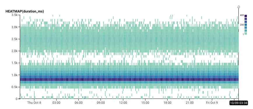
Line charts are a great way to visually represent data and are my go-to choice almost all of the time. However, there are instances when they may not be sufficient for quickly grasping an overview of a system. In such cases, heatmaps are an excellent alternative. Heatmaps use colors and color saturations to represent data values, creating a 3D chart that is particularly useful for high-frequency data or when understanding general patterns is more important than exact values.
For example, we are mapping the duration_ms over time and the frequency of those values below:
Group your data with meaningful tags
When creating your dashboard, consider using tags such as region, service, and http_status. This makes it easy to filter results and identify issues. Additionally, using tags instead of hardcoding IPs allows you to change your fleet without worrying about updating dashboards. This makes maintaining your dashboard up-to-date effortless.
The end
In conclusion, building a metrics dashboard system requires careful consideration of the UX for SREs. Avoiding confusing chart types such as spaghetti charts and pie charts, making explanations and playbooks accessible, and using meaningful tags are all important steps to creating a useful and effective dashboard. Line charts are a common chart type, but heatmaps can also be useful for high-frequency data or when seeing general patterns are more important than exact values. Ultimately, a well-designed dashboard can help teams quickly identify and respond to issues in their systems.